

Overview
Title
Flipboard Redesign
Summary
A self-guided project motivated by confusion and frustration with the Flipboard app- a "how would I do this differently" experiment. This vision was free of any business or technical constraints.
Date
January 2018
Tools + Skills
Discovery research, heuristic analysis, rapid prototyping, Illustrator
Challenge
Flipboard is a news and news sharing app designed to give users a customizable newsfeed experience, while encouraging exploration and deep immersion into their content. Currently, users (especially new users) are confused and limited by unintuitive navigation. The expected scrolling functionallity on most digital platforms conflicts with the “magazine” experience Flipboard is trying to simulate.

Define
I first identified the most pervasive pain points from App Store and Google Play reviews. In terms of navigation, many remarked on how they frequently get lost, cannot find a recently viewed article, or get disoriented when they get deep into the reading. Another place of confusion seems to be the inconsistent flipping experience as some websites/articles are only scrolling.
I then recorded my first impressions of the app in attempt to identify why I was not enjoying it as much as my other news applications. I was getting lost and disoriented more than I was reading the content. Even after a few weeks with the app, I was still never sure where the next swipe left/right/down/up would bring me. Sometime the page of my current article changed, other times I started scrolling, sometimes I found related articles, other times a swipe led me nowhere.
Lastly, I observed two other users engage with the app for the first time and asked them to explore, save an article, and create a customized newsfeed. One user gave up before reaching the last task. Both users expressed frustration for continually hitting adds, screens or buttons that they did not intend to hit. It was also clear that both users did get a handle on the flipping patterns or navigation between magazines and articles.
“Wait why am I scrolling all of a sudden? I don’t get why some scroll and some flip.”
Flipboard’s unique navigation attempts to combine the digital and physical experience of reading articles but instead makes for an inconsistent and unintuitive experience. A redesign is needed to deliver news in an efficient and equally creative way that avoids interruption or misdirection.
Explore
Improved navigation while maintaining the magazine experience was the prioritized improvement when starting the redesign. I implemented an analogous product method. A user was viewed interacting with a physical magazine in order to gain more inspiration for the redesign. Points worth mentioning upon this observation include:
Did not initially flip to the first page, but soon returned to table of contents
Flipped 2-3 pages at a time, often jumping around to see what caught his interest
Dogeared an article to remember to revisit it
Acknowledged the full-page spreads were eye-catching and indicative of an important story
Appreciated when words in the article were in bold to give him a better sense about what it was about (beyond the headline)
In addition to this exercise, other news applications (ESPN, CNN, Apple News) were looked at for inspiration. Pinterest was also referenced as an app that simulates a physical experience (pinning ideas to a tack board) .
A sample of some sketches following the research and explore phase:
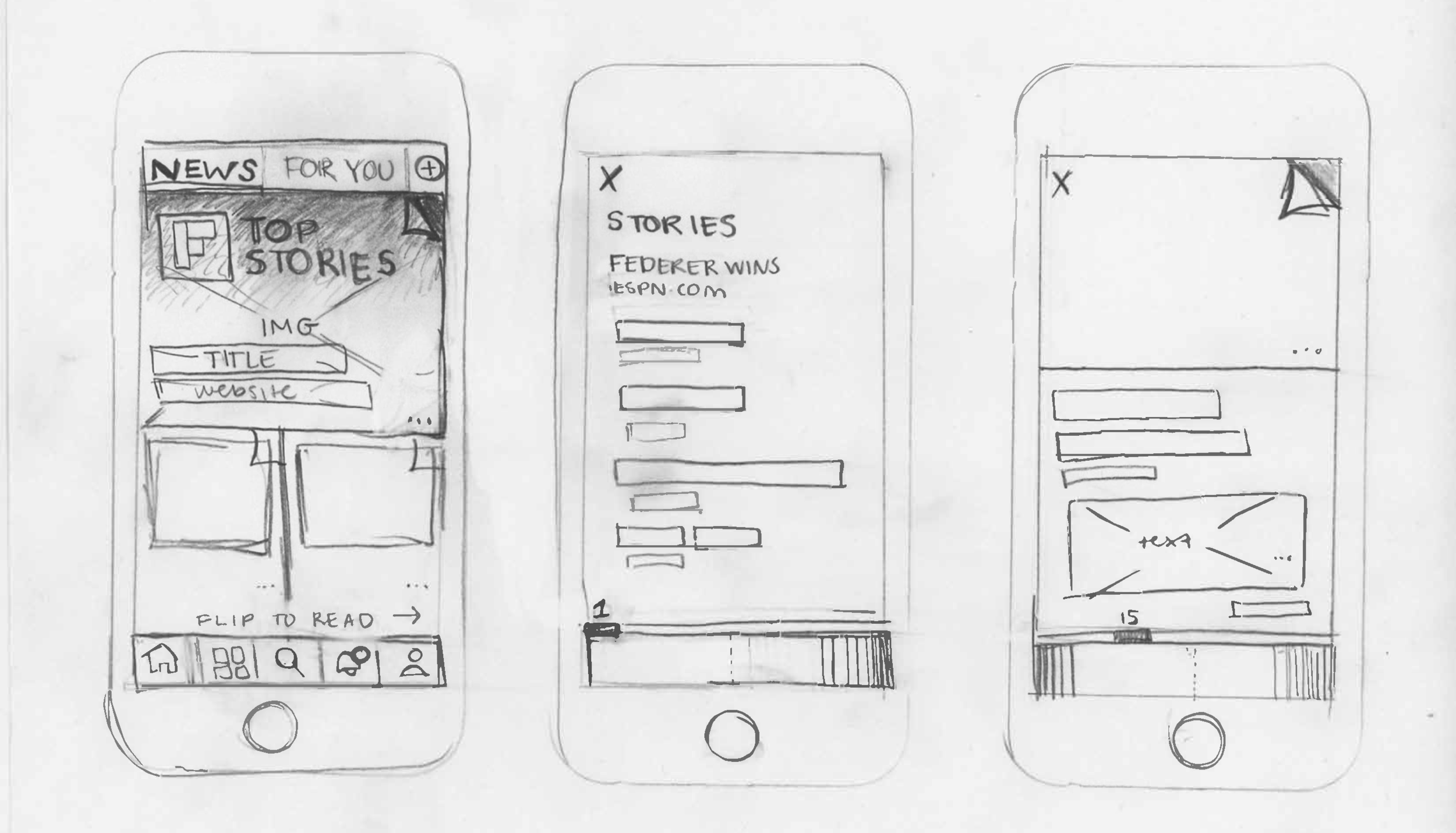

The major changes during the redesign were the new flip direction and the navigation bar. These features intend to lend a more maneuverable, consistent news experience while maintaining the immersive feeling of a real magazine. The navigation bar keeps track of progress while replacing the comments and back arrow that often got in the way of reading or engaging. The horizontal flip 1) better resembles a magazine and 2) allows for Flipboard to use sources that do not offer the vertical flip and prevents confusing users on the inconsistencies.
Testing and iteration would ideally follow this redesign.

